CSS Conic Gradients
CSS Conic Gradients A conic gradient is a gradient with color transitions rotated around a center point. To create a conic gradient you must define at least two colors.
Syntax
background-image: conic-gradient([from angle] [at position,] color [degree], color [degree], ...);
By default, angle is 0deg and position is center. If no degree is specified, the colors will be spread equally around the center point.
Conic Gradient: Three Colors
The following example shows a conic gradient with three colors:
OUTPUT:
Conic Gradient: Five Colors
The following example shows a conic gradient with five colors:
OUTPUT:
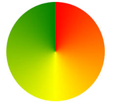
Conic Gradient: Three Colors and Degrees
The following example shows a conic gradient with three colors and a degree for each color:
OUTPUT:
Create Pie Charts
Just add border-radius: 50% to make the conic gradient look like a pie:
OUTPUT:
Conic Gradient With Specified From Angle
The [from angle] specifies an angle that the entire conic gradient is rotated by.
The following example shows a conic gradient with a from angle of 90deg:
OUTPUT:
Conic Gradient With Specified Center Position
The [at position] specifies the center of the conic gradient.
The following example shows a conic gradient with a center position of 60% 45%:
OUTPUT:
Repeating a Conic Gradient
The repeating-conic-gradient() function is used to repeat conic gradients:OUTPUT:
Here is a repeating conic gradient with defined color-starts and color-stops: