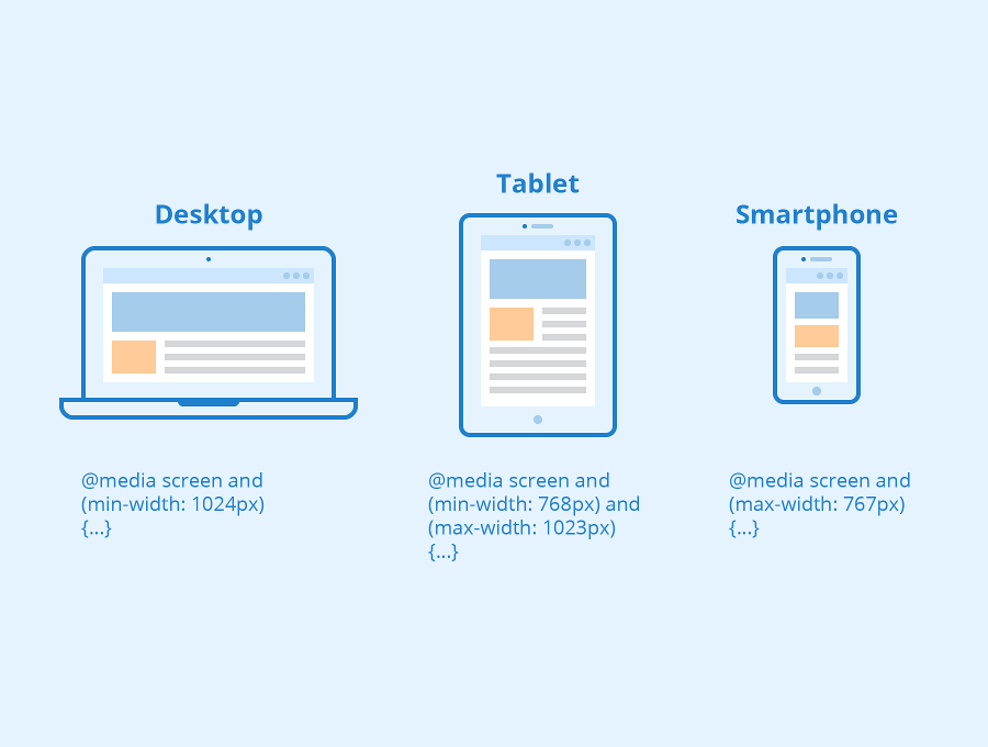
CSS Media Queries - More Examples
Let us look at some more examples of using media queries.
Media queries are a popular technique for delivering a tailored style sheet to different devices. To demonstrate a simple example, we can change the background color for different devices:
Output :
Media Queries For Menus
In this example, we use media queries to create a responsive navigation menu, that varies in design on different screen sizes.
Output :
Media Queries For Columns
A common use of media queries, is to create a flexible layout. In this example, we create a layout that varies between four, two and full-width columns, depending on different screen sizes:
Output 3:
Hide Elements With Media Queries
Another common use of media queries, is to hide elements on different screen sizes:
I will be hidden on small screens.
Output :
Change Font Size With Media Queries
You can also use media queries to change the font size of an element on different screen sizes:
Output :
Flexible Image Gallery
In this example, we use media queries together with flexbox to create a responsive image gallery: